
Essential Tips for Cinematic Color Grading in Digital Content


Color grading is an essential part of the post-production process in digital content creation. It can transform an ordinary scene into a visually stunning masterpiece, evoking emotions and enhancing storytelling. Whether you are a seasoned professional or a budding filmmaker, understanding the nuances of cinematic color grading can elevate your work to new heights.
Understanding the Basics of Color Grading
Before diving into advanced techniques, it's crucial to understand the basics of color grading. This involves adjusting the colors in your footage to achieve a specific look or mood. Grading is different from color correction, which typically involves fixing any color issues to make the footage look as natural as possible.
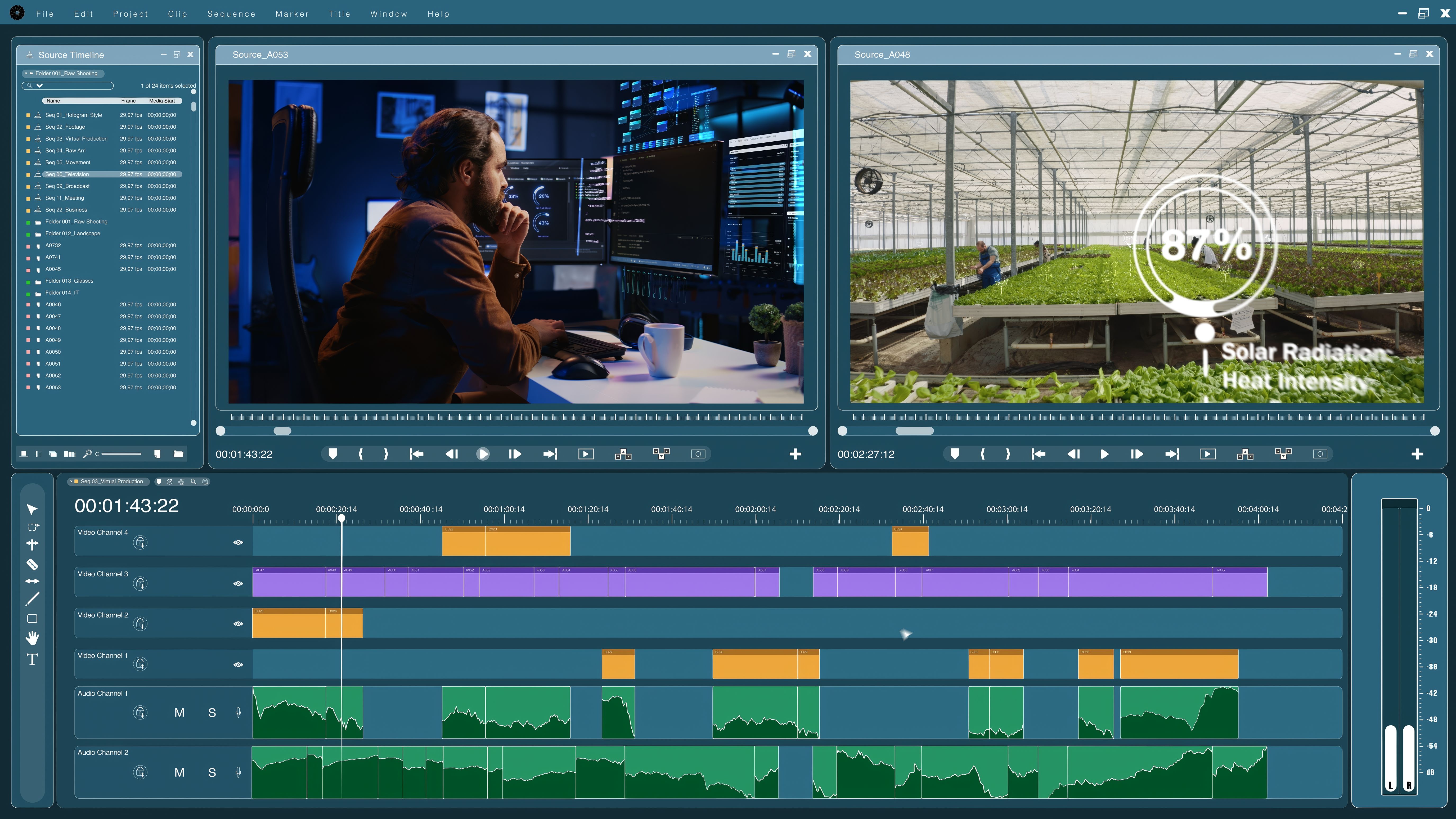
To begin, familiarize yourself with color grading software such as DaVinci Resolve or Adobe Premiere Pro. These tools offer a variety of features and settings that allow for precise adjustments to luminance, saturation, and hue. Mastering these tools is the first step toward achieving professional-grade results.
The Importance of Color Theory
Color theory is fundamental in creating visually appealing content. By understanding how different colors interact and complement each other, you can craft scenes that convey specific emotions or atmospheres. For instance, warm tones like red and orange can evoke feelings of warmth and happiness, while cooler tones like blue and green can create a sense of calm or melancholy.
Utilize tools like the color wheel to experiment with complementary and analogous color schemes. This practice will help you develop a keen eye for selecting the right palettes that align with your creative vision.

Techniques for Achieving Cinematic Looks
Achieving a cinematic look often involves emulating the aesthetic qualities of film. One popular technique is the use of film LUTs (Look-Up Tables). LUTs can be applied to your footage to mimic the color characteristics of traditional film stocks, adding depth and richness to your visuals.
Another technique is adjusting contrast and exposure to create dynamic ranges that mimic film's natural texture. Experiment with different levels to see how they impact the mood and tone of your scenes.

Maintaining Consistency Across Scenes
Consistency in color grading is vital for maintaining a coherent visual narrative. This means applying similar grading techniques across all scenes in your project to ensure uniformity. A disjointed color palette can distract viewers and detract from the overall storytelling experience.
One way to achieve consistency is by creating and applying a custom LUT throughout your project. This ensures that all scenes adhere to the same color standards, making your content more professional and polished.
Final Touches and Review
Once you have completed your initial grading, it’s important to review your work and make any necessary adjustments. This might involve fine-tuning specific elements or balancing colors to achieve a harmonious look.
Remember to view your content on different screens and devices to ensure the colors remain consistent across platforms. This step is crucial as it helps you identify any discrepancies that may arise due to varying display settings.

Conclusion
Cinematic color grading is both an art and a science. It requires patience, practice, and a keen eye for detail. By mastering the basics, understanding color theory, and employing advanced techniques, you can create digital content that captivates and resonates with audiences. Keep experimenting and refining your skills to stay at the forefront of this ever-evolving craft.